Architecture
Designing with Emotion: How Color Psychology Shapes Powerful Interiors

Designing with Emotion: The Science of Color in Space
Have you ever walked into a room and instantly felt calm, energized, or even anxious—without knowing why? This blog is all about why that happens. At AI Spaces, we believe that great design doesn’t just look good—it feels good. And a big part of that feeling comes from the colors we choose.
In this post, we’ll explore color psychology in design, diving into how different hues impact emotion, how to choose colors that affect mood, and how to apply these insights to create emotionally intelligent spaces that elevate the human experience.
.png)
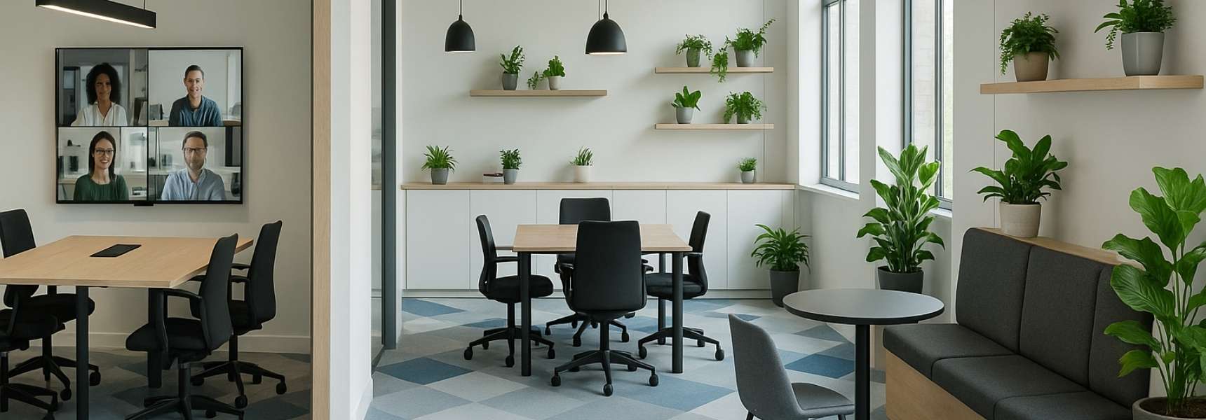
The Power of Color: More Than Just Aesthetic
Color is one of the most powerful tools in an interior designer’s toolkit. It’s not just about matching furniture or following trends—it’s about tapping into the subconscious. Color psychology studies how hues influence perception, behavior, and emotion. From hospitals to restaurants to offices, the color palette can shape how people think, feel, and interact with a space.
At AI Spaces, we use this science to design commercial interiors that inspire productivity, creativity, comfort, and trust—depending on the space’s goals.
How Colors Affect Mood: The Basics
Each color evokes a different emotional response. Here’s a breakdown of commonly used colors and their psychological effects:
- Blue: Calm, trust, and stability. Ideal for offices, healthcare, and corporate spaces.
- Red: Bold, energetic, and stimulating. Great for restaurants or fitness environments.
- Yellow: Cheerful and optimistic—but in excess, can cause anxiety. Best as an accent.
- Green: Balancing and refreshing. Associated with nature and tranquility—great for wellness or collaborative areas.
- Purple: Creativity, luxury, and wisdom. Ideal for creative agencies or high-end lounges.
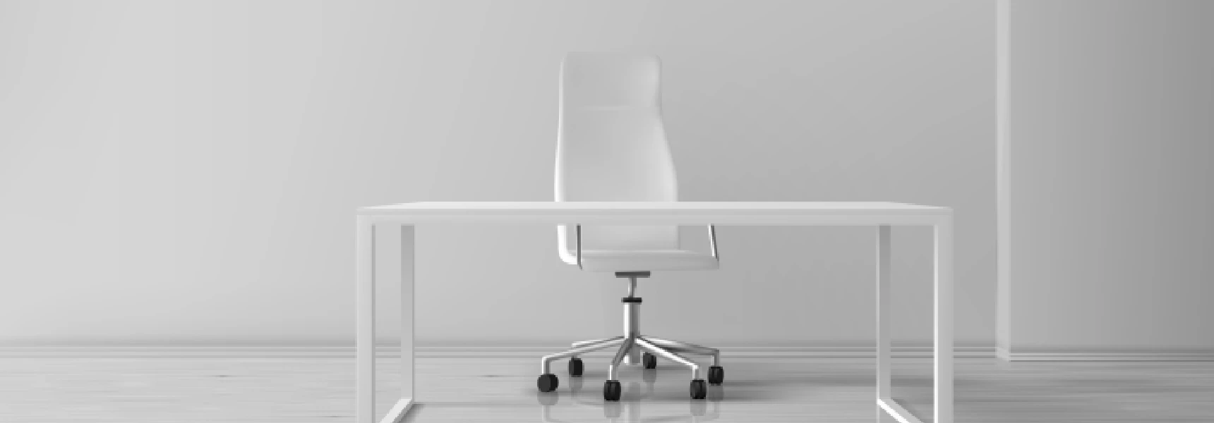
- White: Clean and minimal. Too much can feel sterile; pair with warm tones to soften.
- Black: Sophisticated and grounding when used intentionally. Adds contrast and drama.
- Orange: Warm and enthusiastic. Great for informal or energizing spaces.
Designing with Emotion: How to Choose Colors That Affect Mood
.png) 1. Start with Purpose
1. Start with Purpose
Before selecting a color, ask: What is the primary purpose of the space? Is it meant to energize, calm, inspire, or impress? The emotional goal should drive the palette.
- A law office might use navy blue and deep wood tones to promote trust and stability.
- A creative studio could incorporate orange, purple, and soft green to encourage innovation and ease.
- A wellness spa might lean on soft neutrals and greens to promote relaxation and comfort.
2. Understand Your Audience
Different cultures and demographics interpret colors differently. For example, white may symbolize purity in one culture and mourning in another. Age, gender, and industry also influence perception.
That’s why we always consult with clients about their target audience before proposing a color direction.
3. Use Contrast Strategically
High contrast energizes, low contrast soothes. A balanced contrast creates visual interest without overwhelming the senses.
For example, a coworking space might use soft green walls (calm) with orange accents (energy) to support both focus and vitality.
4. Lighting Changes Everything
Lighting affects how colors appear and feel. A cozy yellow might turn flat under harsh fluorescent lights. Always test color choices under real lighting conditions before committing.
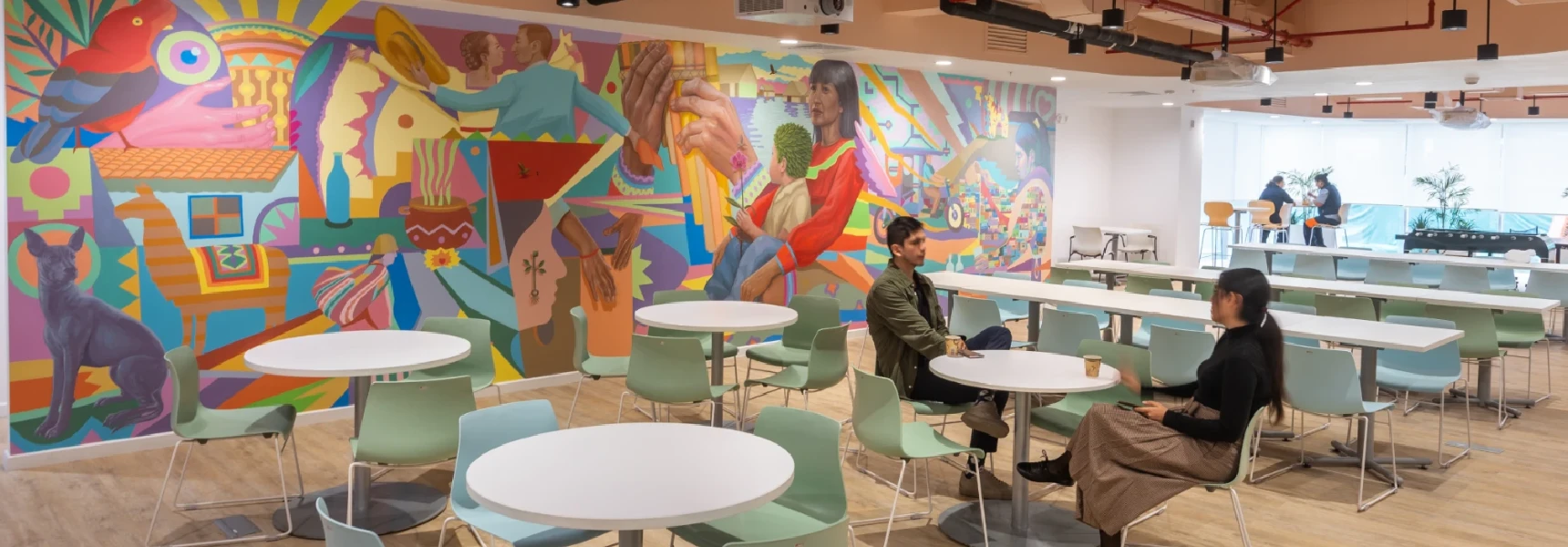
Real-Life Examples from AI Spaces
- Corporate HQ Design: A tech startup used blue-gray tones for trust and vibrant orange in breakout areas. Result: improved focus and reduced stress.
- Legal Workspace Refresh: A law firm replaced stark white walls with soft beige and navy for warmth and professionalism.
- Health & Wellness Studio: Earthy greens and warm neutrals created a calming, holistic experience aligned with the brand.
Tips for Using Color Intentionally in Commercial Design
- Use accent walls to introduce bold hues without overwhelming the space.
- Tie color to function—cool tones for focus zones, warm tones for social areas.
- Repeat color cues through furniture, materials, and artwork for cohesion.
- Stay flexible—use changeable elements like paint or décor for trend colors.
.png)
Color Trends in 2025: What's Coming?
Timeless principles still apply, but 2025 brings emotionally nuanced palettes to the forefront:
- Digital Lavender: Calm and balanced—perfect for wellness and tech environments.
- Warm Clay Tones: Terracotta and earthy oranges evoke comfort and authenticity.
- Midnight Teal: A rich, modern blue-green that adds depth and sophistication.
We’re also seeing biophilic palettes—colors inspired by nature—especially in hybrid workplaces and wellness-focused interiors.
Final Thought: Color is More Than Paint
At AI Spaces, we believe color is emotion made visible. When used with intention, it transforms a space from simply functional to deeply impactful. Whether you're designing an office, studio, or retail location, understanding color psychology in design gives you a powerful advantage.
Ready to Design with Emotion?
Let’s transform your space into one that feels as good as it looks. Contact AI Spaces today to schedule a consultation and discover how color psychology can elevate your next project.
More Articles to Keep Designing Your Workspace
Guides, inspiration and workspace ideas