Innovation
A Splash of Genius: How to Use Color Psychology to Design Better Meeting Rooms

Design & Psychology
Images by AI Spaces | Warner Music
Meeting room interior design affects behavior more than most brokers,and even many clients, realize. Color influences mood, focus, collaboration quality, and even how people appear on camera.
Color isn’t decoration, it’s a functional tool. Below is a refined guide to help you guide clients toward smarter build-out decisions.
Color Psychology for Different Meeting Room Types
| Room Type | Recommended Colors | Psychological Impact |
|---|---|---|
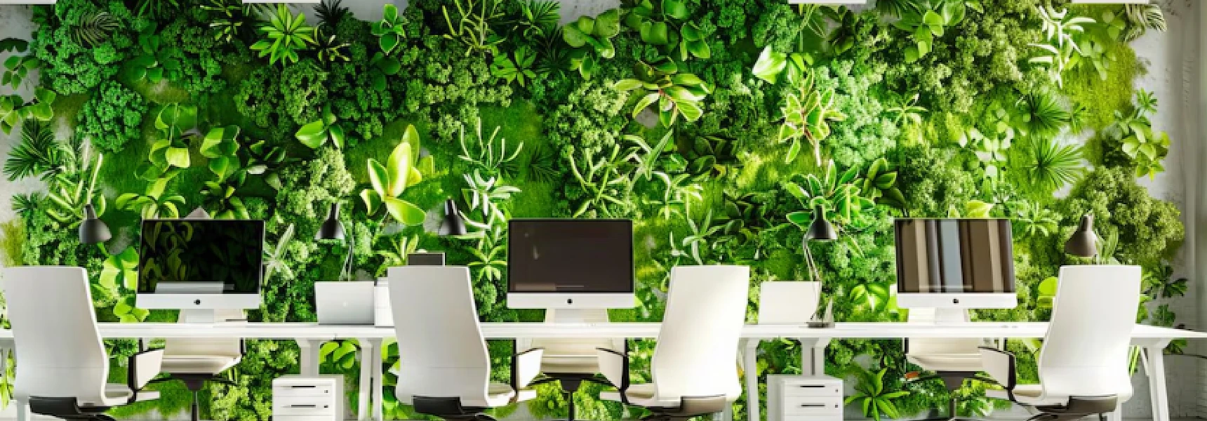
| Focus Rooms | Soft blues, greens, muted neutrals | Calm, clarity, reduced stress |
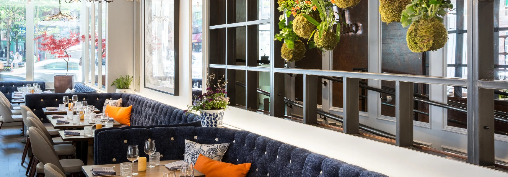
| Collaboration Rooms | Warm neutrals, mustard, clay | Energy, conversation, creative flow |
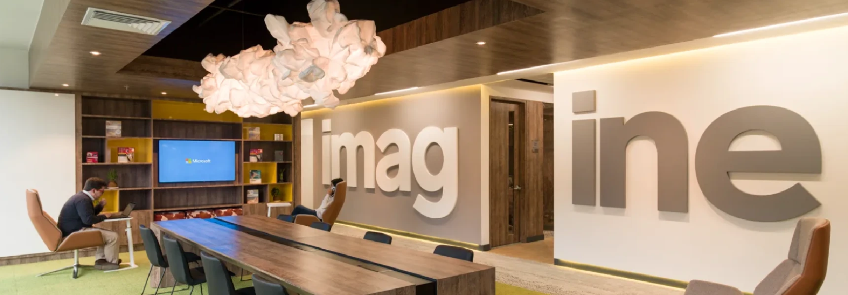
| Client Boardrooms | Navy, charcoal, walnut | Authority, trust, credibility |
| Hybrid/Video Rooms | Soft blues, taupe, warm white | Flattering for camera, low glare |
Factors That Change How Colors Perform
- High-Sun Markets (FL, TX): Intense sunlight washes out light colors. Use desaturated blues or sandy taupes.
- Cloudy Regions (PNW): Rooms feel cold with cool neutrals. Use warm undertones (camel, terracotta) to counterbalance.
- Urban Markets (NYC, Chicago): Clients respond well to darker, sophisticated palettes like charcoal or navy.
Broker Playbook: Matching Behavior
Focus Rooms
Goal: Eliminate distraction.
Palette: Cool + Calm.
Collaboration Rooms
Goal: Encourage idea flow.
Palette: Energy + Warmth.
Ready to Guide Your Clients?
We can help you build a broker-ready Color Psychology Playbook you can use during test fits and negotiations.
Request PlaybookMore Articles to Keep Designing Your Workspace
Guides, inspiration and workspace ideas